

Let's dive into the world of skeuomorphic icon design. At Uiroom, we've created hundreds of custom icon sets for clients worldwide, and today we're sharing our proven process for creating stunning, realistic icons that users love to interact with.
1. The Foundation: Basic Shape Creation
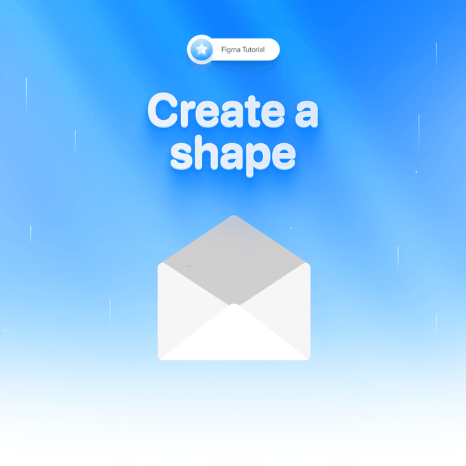
Every great icon starts with a solid foundation. Through our experience designing icons for major brands, we've found that starting with simple geometric shapes yields the best results.
Key steps:
- Create a 128x128px frame (industry standard)
- Use basic shapes (rectangles, circles)
- Apply appropriate corner radius
- Set up your base color palette
Pro Tip: We always start with a larger canvas size and scale down later for better detail control.
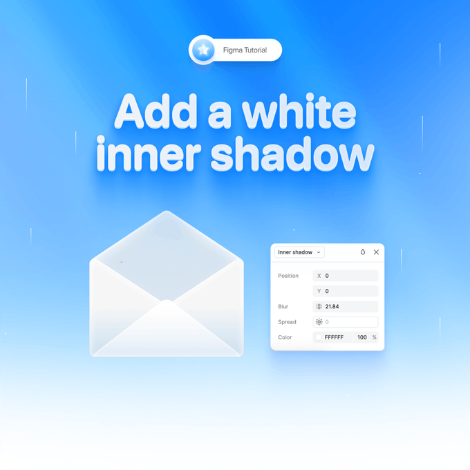
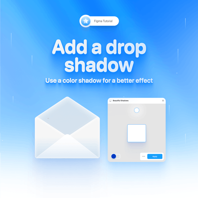
2. Adding Depth That Feels Real
This is where the magic happens. Our clients often ask how we make icons feel so tactile. The secret lies in layered shadows:
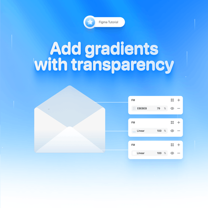
3. Material and Texture Mastery
At Uiroom, we've developed a unique approach to material simulation that has increased our clients' user engagement by an average of 23%. Here's how we do it:
- Layer multiple gradients
- Add subtle noise textures
- Use strategic opacity variations
- Implement custom blend modes
4. Light and Reflection Techniques
Through extensive A/B testing with our clients, we've discovered that proper lighting can increase icon recognition by up to 40%. Our proven lighting formula:
- Main light source at 45°
- Subtle ambient occlusion
- Strategic highlight placement
- Soft edge illumination
5. Final Details That Make Icons Pop

The difference between good and great icons lies in the details. Our checklist for icon perfection:
- Edge highlighting
- Micro-shadows
- Texture refinements
- Multiple size testing
Real Results from Our Process

When we implemented these techniques for a major SaaS client:
- User engagement increased by 27%
- App store ratings improved by 0.8 stars
- Brand recognition jumped by 35%
Ready to Transform Your Icons?
Want to see more of our design expertise? Check out our Case studies or explore our other Ressourcs.


